APCA contrast
Why you should trust me as a UX designer even though my site fails WCAG-2 contrast
If you're looking for an in depth explanation of what APCA is, the math behind it, and want to gain a coherent understanding of it, then you're in the wrong place. For a comprehensive understanding I'd recommend checking out this article by Collen Gratzer where she interviews Andrew Somers (APCA guru).
If you are merely looking for a quick and easy guide to APCA, this is the place.
A quick guide to APCA; what it is and how to use it
APCA, a contrast tool, is expected to be included for WCAG 3.0. As of today, we are still guided by WCAG 2.2, and its respective contrast checker. So why bother talking about APCA?
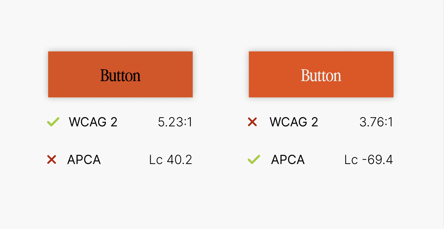
In short, APCA does what WCAG contrast can't. It is basically the same tool, but with a different math. If you've been designing for some time, you've probably tried out the WCAG contrast tool, and possibly gotten frustrated when the colours you've chosen aren't AA or AAA approved - even though they look more than readable.
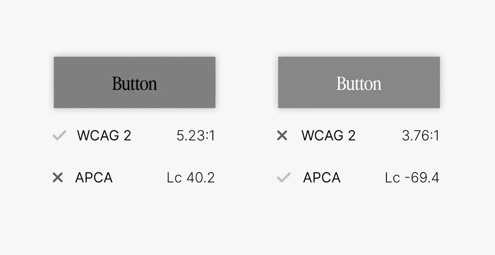
Below is a real life example. Personally I feel the black and white example really shows how WCAG messes up.


How to read APCA - understanding the Lc
My main issue when trying out APCA for the first time, was all the numbers and what they meant. WCAG is easy, APCA requires a few minutes of reading. So, without further ado, here comes a simple list about what you really need to know:
Lc ranges from Lc-108 - Lc 0 - Lc106
Maximum contrast: 90 Lc - preferred level. Increase weight for smaller fonts.
Body: 75 Lc - Similar to WCAG 7:1
Medium text: 60 Lc - No smaller than 24px. Similar to WCAG 4.5:1
Big text: 45 Lc - No smaller than 36px. Similar to WCAG 3:1
For light colours on dark backgrounds, 60 Lc becomes -60 Lc etc.
Disclaimer: this is a super simplified way of reading APCA. APCA considers weight and encourages you to account for the X-height of the font as well as other aspects. But, this is enough information to start using APCA, without getting overwhelmed.
All articles